Call us old fashioned. Jim and I love to sit down together and eat our meals at a real table! This dining room was perfect for us: not too huge, not too far from the kitchen, and not part of the kitchen!
Since it’s such an important room to us it’s gotten some serious love since we moved in! These things never happen overnight, especially not when we both work full time and can only dedicate so much time to improving our house. But bit by bit, we did it!! Here’s our dining room’s journey.
Watch our Dining Room Evolve!
November 2010
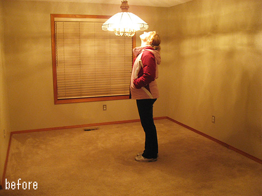
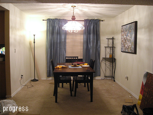
Here it is in all its grey-walls, brown-trim, and metallic outlet cover glory. Jim snapped this photo of me telling the old light fixture its days are numbered the day we got our keys!
December 2010
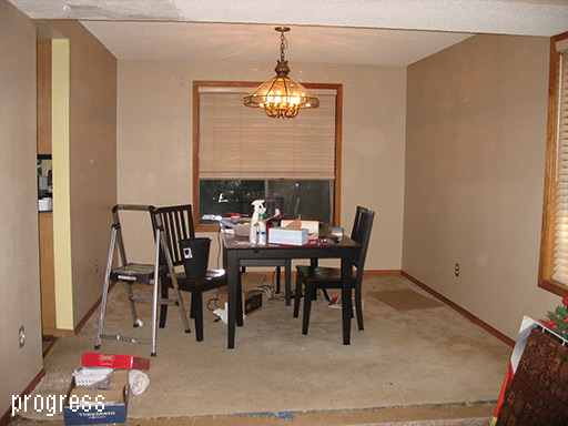
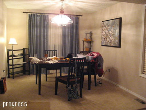
The dining room was quickly filled with tools and supplies. We moved our table and chairs in, and then loaded the room with tools, paper towels, supplies – so much stuff, in fact, we ultimately lined this room with shelving to hold it all. I neglected to photograph it, but for a month or so this room looked more like a garage than a dining room.
January 2011
With the holidays (and the flu) behind us, it was time to paint the dining room!
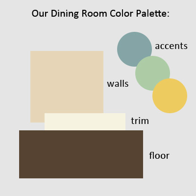
The room originally had very high gloss, greyish brown walls and natural wood trim which has a nearly orange hue. The neutral carpet is worn out, but we’ve been keeping it until we’re ready to tackle our flooring redo. Here’s sort of what the original palette was like – but it varies a lot depending on the lighting!
We first applied spray-on de-glosser to the shiny walls to help our new paint stick. I’m definitely an eggshell person – the shiny walls were driving me nuts! I swear I could almost see myself in them.
I wanted to brighten the room and just make it more “us”. We tend to like lighter colors, but I’ve seen just about every color look great on walls. I chose a light “almond” color for the walls and an off-white for the wood trim.
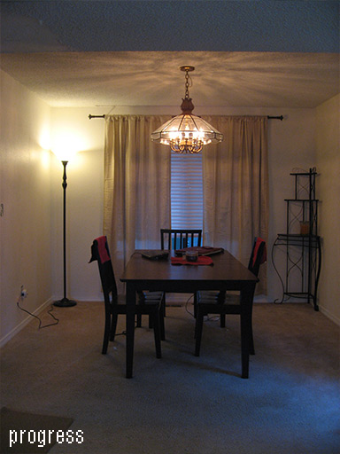
Inspired by how great the room looked after a few coats of paint, we mounted a curtain rod and beige curtains from Bed Bath and Beyond. But something wasn’t quite right… the curtains were too vanilla.
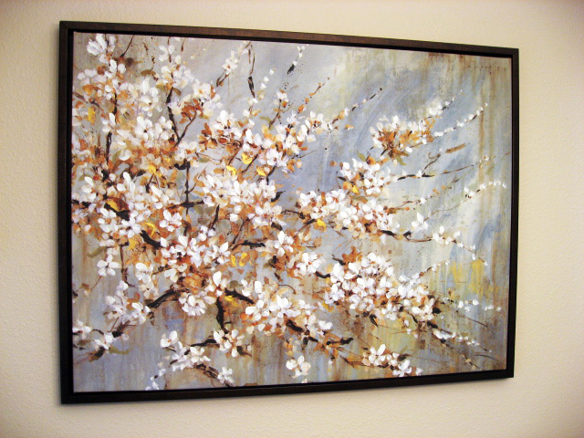
Back at the ‘Beyond we spotted this gorgeous floral painting:
We grabbed it plus curtains to match and put them both in the room. Success! (But the curtains were too short – fortunately, clippy rings were invented for this very reason!)
We let the color palette of the painting guide the rest of our color choices for this room, adding napkins, place mats, and eventually several other items in the same colors.
I put our three-tiered shelving unit into the other corner, giving us some much-needed storage space in this room. We also rotated the table 90 degrees. The room was really starting to feel like our own!
I replaced all of the room’s electrical outlets (Light Almond color from Home Depot), since the old ones were worn and plugs were falling out. I also tossed the mirror-like metallic outlet face plates and installed matching Light Almond covers – now the outlets just disappear into the wall!
May 2011
We left the room alone for a few months until my dad came to visit in May. Dad is very handy. He holds a Master’s in Light Fixture Bracketology, which he put to good use helping us replace the old and dated light fixture with a snazzy new one! I was very picky about finding the right light fixture – the light cups had to point upwards (we hate seeing the bulbs!) and it had to be Just The Right Size. Fortunately, McClendon’s Hardware (Bothell, WA) came through for us with this gem:
June 2011
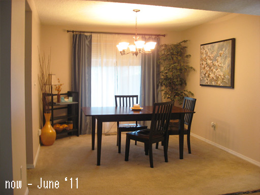
Decorating! We added a tree and big golden vase, both from MyHome (located in Kirkland, WA).
April 2012
Flooring! At last, we tore up the last vestiges of the old flooring in this house and installed a uniform laminate throughout the entrance, kitchen, and dining room areas.
It’s so warm and inviting! I just love sitting down to a plate of pancakes on a Saturday morning or a big steak after work in this room. :)
