Budget DIY Kitchen Remodel: Why We Chose a Solid Surface Countertop

We’ve scheduled a contractor to come out on March 15th and give us an estimate for all of the following:

  • new countertops
  • new sink + new faucet
  • laminate flooring in dining room, kitchen, drop zone, and hallway
  • lighting changes – just something that isn’t three ugly fluorescent bulbs

That means we have until March 14th to procrastinate on choosing colors need to make a decision on this counter top!

Our new counter top must-haves:

  • Undermount sink!
  • No bizarre cleaning regimens (I don’t want to seal / buff / oil anything)
  • Reasonably durable, though neither of us is particularly destructive nor do we intend to chop food or put hot pans on the counter
  • Must be cleanable with normal cleaning solutions, like Lysol kitchen spray
  • Affordability – our budget for this kitchen update is around $5000
  • Stain resistant – we can be messy

This kitchen’s a work zone. We both cook twice daily.  I don’t know where some of these counter top manufacturers get off making counter tops that aren’t rugged or stain proof but I suppose if you don’t actually use the counter top for cooking, it’s fine if it’s made of paper mache.

Corian solid surface counter top quickly became a front-runner.  Young House Love first drew my attention by choosing it for their kitchen.   (I swear I am not stalking them.  Okay, maybe a little.)

We eventually decided on Corian for all of the following reasons:

  • Non-porous (stain resistant!) and solid all the way through, so if terrible things happen they can be sanded/buffed out
  • Highly rated by Consumer Reports
  • Works with undermount sink, wooo
  • I just like the feel of Corian.  As in, I REEEEEALLY like the FEEEEEEL of it.  It’s so soft and smooth.   (Actually, forget I said that, that was creepy.)

The next challenge was figuring out what color to go with.  I hate agonizing over colors, I really do, but with the counter top making up about half our kitchen update budget, I couldn’t afford to just choose on whim.

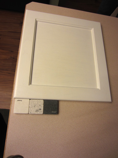
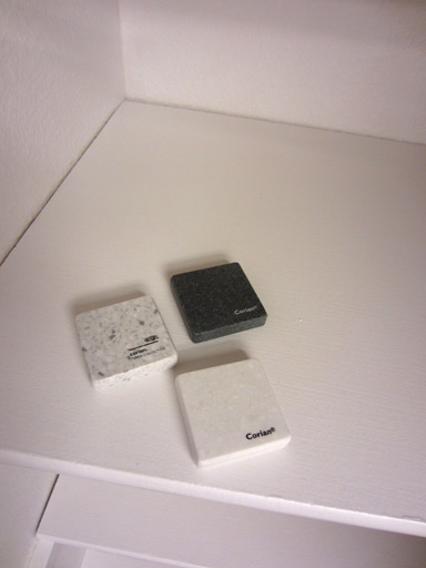
Here are our samples, chillin’ on the pantry’s painted shelves.


There’s a slight “warm” tone to the less-speckled white Corian sample which clashes just a tad with the cabinet paint color.  (But seriously, that observation can safely be filed under “shit only Mandi would notice”.)

Ehh?  I feel like no matter which one I pick, it’s going to be WAY better than the aging off-pink laminate with scuffed up wood border that we have now.  I think the speckly grey/white one is my favorite.  The ‘Pot had a sample similar to it with tiny black flecks, but it looked way too much like Oreo crumbs in milk.  Not that I don’t love Oreos or milk or the combination thereof, I just worry about the world’s Oreo supply should I crave Oreos every time I go through my kitchen.  Ultimately, we chose a bright speckled white (and it was perfect).

When we went to make the purchase at Home Depot, we discovered Samsung had a promotion on their version of Corian that brought the price of a Samsung Staron counter top several hundred under the cost of the same counter top in Corian.  There we were, presented with another option we hadn’t even considered after hours of ruling out other choices.  A quick look at online reviews revealed Staron is just as well reviewed as Corian and chemically quite similar, so we said what the hell and went with it.

Our gorgeous Staron counter top was installed a few weeks later!
Games I’m Playing (More fun than watching paint dry)

What do I do while waiting on things to dry?  Why, I play games, of course!  Lately I’ve been playing a lot of iOS games on an iPod.

For those just visiting or not familiar with what I do: I work as a game designer of what’s known as “freemium” games – that’s a game you can download and play for free, typically on your iPhone, iPod Touch, or Android, that offers in-game stuff or advantages for purchasing with real money to enhance your experience.  It’s not everyone’s favorite kind of game, but I love mobile games and since this is the big trend right now, I’m happy to dive in.

Here are a few of my favorites right now.

Quest Runner: Hilarious dialog and simple, quick-paced gameplay that’s n00b friendly.  I’m  36 or so levels in and I’m still having a ton of fun.  I especially like that gameplay isn’t limited by an energy meter (worst game design trend, ever.)  Also, the complete lack of a “pay wall” (the point at which you can’t progress without buying something with real cash) is a huge win.  Trident3D, you guys rule.

Lumby, I love you.

Socktopus, I love you.

Hatchi: Similar in presentation and spirit to the Tamagotchis and knock-offs of the late ’90s.  Wy is now 30 days old, and going!

Who’s my widdle babby? You’re my widdle babby!

Monster Galaxy: Simpler than Pokemon (only one attack type per “moga”, instead of several) but similar in design.  Collect monsters, train them, fight them against other monsters, repeat until you’ve caught ’em all.   The monsters are adorable, and I love naming them.  My Leviathan is named “OMG”, and I never get tired it, lol.

An unexpected delight in this game are its cutscenes and characters.   Monster Galaxy and Quest Runner both just crack me up.

Tiny Tower: Imitators are flooding onto the market but my heart still belongs to the original. 135 floors now!

If you want to friend me on GameCenter, I’m “Ungoddess”!

Budget DIY Kitchen Remodel: Pantry Makeover (Part 2)

… I continue my quest for a pantry that isn’t nicotine-colored!

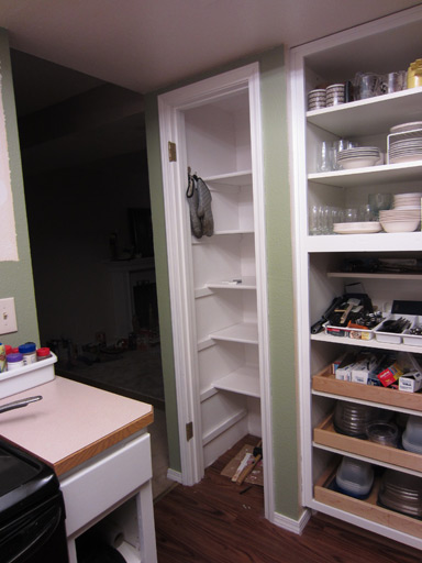
The shelves were first primed on both sides (with 2 days or so of dry time in between), and then painted with the same Benjamin Moore enamel stuff on both sides.  With nearly 7 days of drying time completed now for the undersides of the shelves, it was time to return them to their rightful place in the pantry.

Behold, a crisp, white pantry!

I want to be good and sure the shelves are fully cured before I jam all my crap back into the pantry, so I’m going to let the shelves continue to dry for a few more days.

Budget DIY Kitchen Remodel: Tearing Out Cabinets

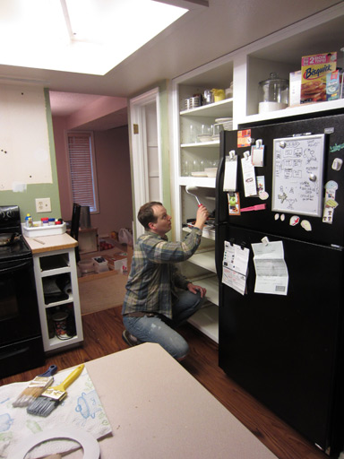
Today started early with the first coat of enamel on the cabinet fronts and the second inside on the cabinet framework. Here’s Jim carefully painting inside:

You’ve already seen a few posts about carefully painting cabinets though, so let’s get to some destruction!! You might recall that our oven-wall used to look like this.

We found this arrangement… lacking.

  • We weren’t utilizing the cabinets well because they are too small and awkward for keeping much in
  • The cabinets block the view at least half of the countertop and the range’s cook top.
  • The over-the-range-microwave has been an aggravation since the day we moved in. It’s just a beast of a microwave, dimming the lights every time it starts up and unable to co-exist with a running toaster oven (blown circuit every time we forget!). We’re not big microwave users, and it always seemed rather ridiculous to be putting a tiny bowl of veggies into something sized for a turkey.
  • Neither of us likes the idea of standing at the stove, cooking, with our head just inches from the microwave when it is on
  • The microwave ventilation was AWFUL! Our downstairs suffers low visibility from steam and smoke pretty much every time we cook (twice a day!). We need a range hood that can keep up with two cooks!
  • It’s just kinda… cramped. Like these cabinets are all up in my business every time I stand near the range or the sink. Like they don’t respect personal space.


There was only one thing to do.

Unscrewing these last two cabinets from the wall was as simple as using the drill to remove 4 long screws. But they remained just as firmly attached to the wall as ever (and to each other).

Mandi: I think these might be glued, look – they aren’t even wiggling when I pull on them.

Jim: Let me try *RIPS CABINETS OFF WALL*

Mandi and Jim: AHHHH OH MY GOD AHHHHHH I GOT IT KEEP HOLDING OKAY PUT IT DOWN AHHHH IT’S HEAVY

Anyway, we did safely lower the cabinet mass onto the countertop, and then we hauled it into the living room, which has become our project graveyard. Ahhhhhh, the kitchen breathes! It’s open! The room feels like it doubled in size. (Okay, maybe not double, but at least 25%. Maybe even 30%.)

Next up: removing the wood backsplash from around the edge of the countertop. Using a screwdriver, hammer, and a weak spot in the trim’s adhesion to the wall, I was able to start the prying-off process like so:

Once the gap was large enough for the crowbar, I used the crowbar to separate the backsplash from the wall.

I thought this method was pretty radical until accidentally punched a wide hole in the drywall with the crowbar, and until the longest portion of the backsplash split horizontally. Oops.

Still, considering the length of the backsplash on the sink wall, this seems like a minor setback. The majority of it came right off after some prying.

YAY!

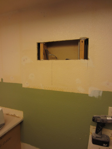
One more thing before we break for lunch and our regularly scheduled weekend chores: cutting out the damaged drywall from behind where the microwave used to be. I’ve seen Dad do this like, once, so that means I’m qualified, right?

I used the level to draw a rectangle around the damaged area and I overshot the studs to give the new drywall patch something to screw into. This was actually a pretty straightforward task, and I was careful not to ram any wires or the back side of our dining room wall. I am going to leave the hole unpatched until I am certain the contractor installing our range hood doesn’t need access to any of the wires inside here.

And here’s where we are now:

Do you like our mess? Admit it, you’re impressed.